The Challenge
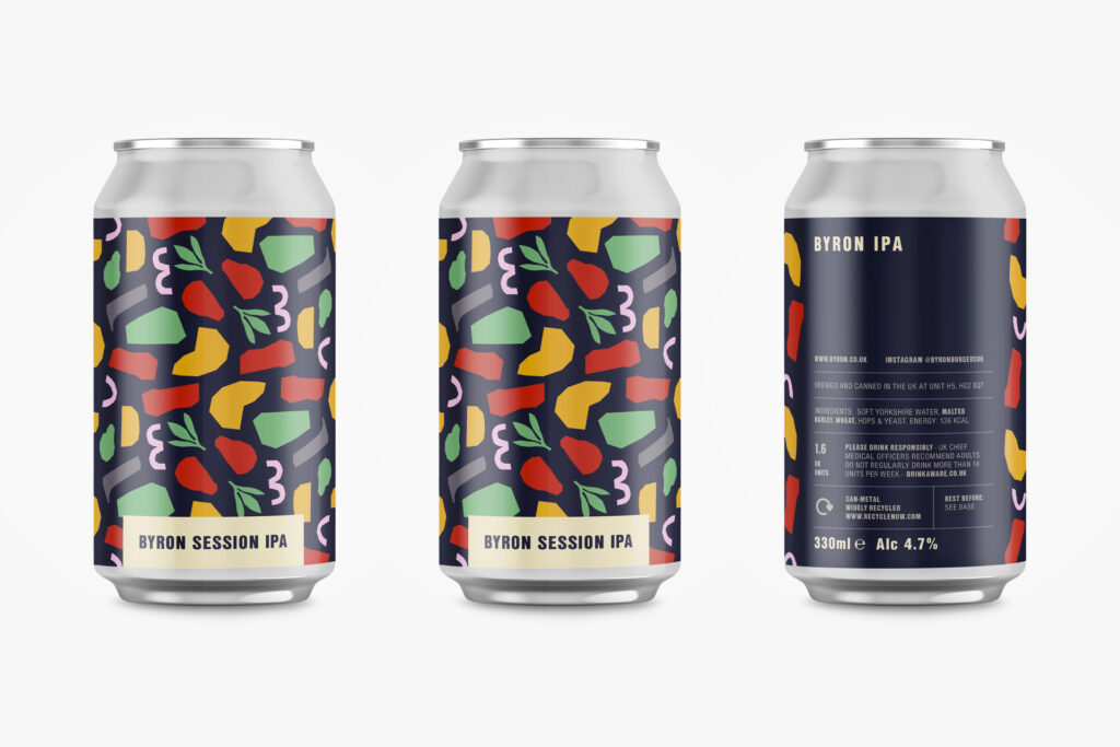
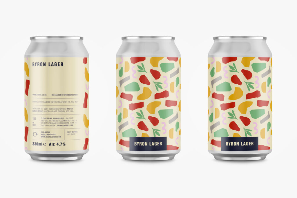
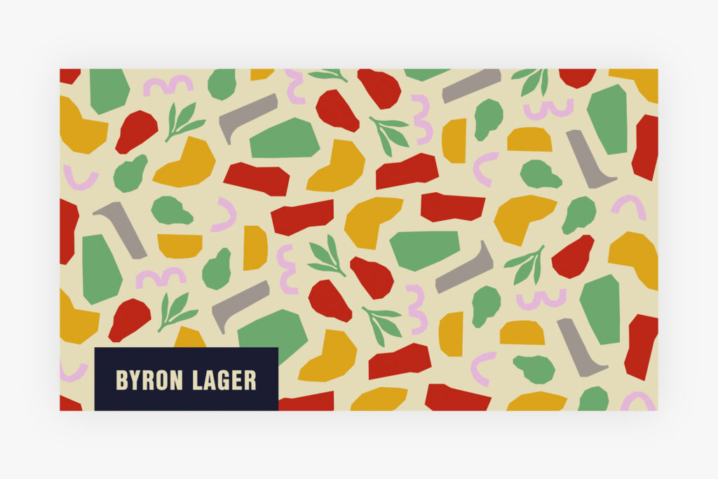
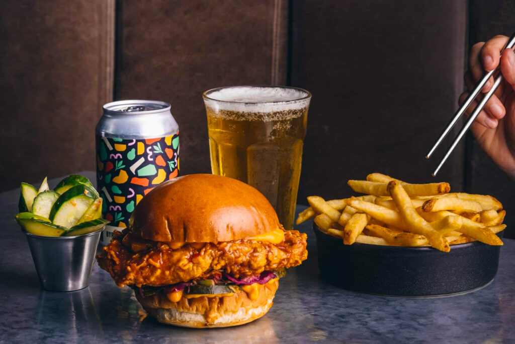
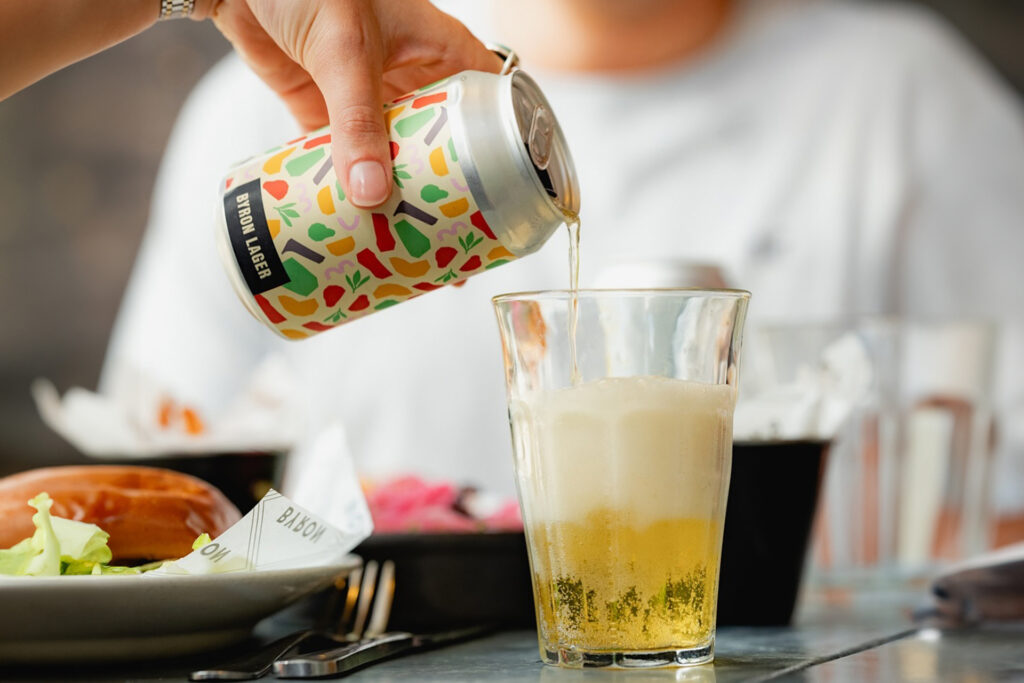
As part of my wider work with Byron, I was asked to refresh the packaging for their own-brand IPA and Lager to bring it in line with the new branding. The design needed to feel like a natural extension of the rebrand – distinct enough to stand on its own, but unmistakably Byron.
My Solution
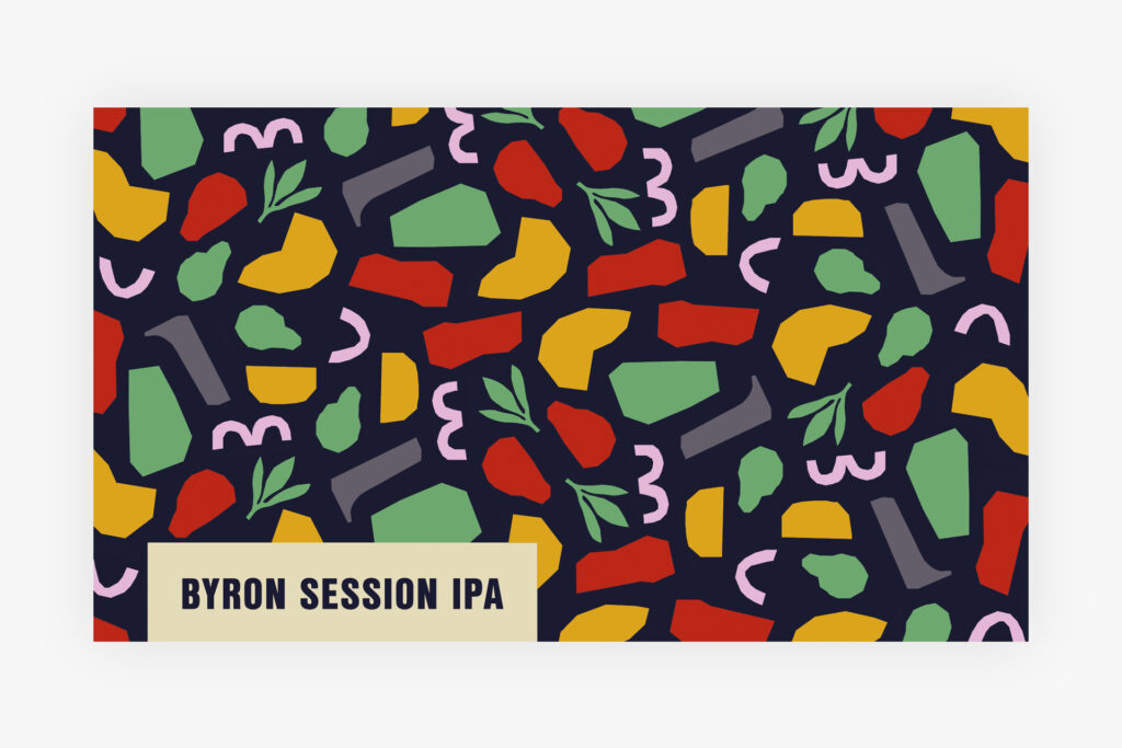
I translated Byron’s new signature ingredient shapes into a new visual language of repeating patterns and colour, designed to express the flavours of each can. This involved proof printing and working closely with printers to ensure colour accuracy and alignment across formats, as well as working with Byron’s legal team throughout to make sure the packaging met all necessary regulations.
Impact
The refreshed packaging launched to a strong customer response, reinforcing that drinks packaging can work as a commercial asset and not just a design exercise.